DOOH Creative
The Essential Guide
Outdoor advertising has one shot to make an impression.
Here's how to make every second count. OOH reaches people in a fleeting moment - moving, distracted, and not actively looking for you. In this guide breaks down how to design creative that gets noticed, understood and remembered.

Creating effective digital out-of-home advertising is both an art and a science. Unlike digital ads that follow users across screens, OOH has one shot - a fleeting moment to make an impression on someone who is moving, distracted, and not looking for you. We’ve put together the below guide to help advertisers get the most out of their outdoor advertising.
Before You Design, Know the Job

brand
awareness
You want people to know you exist and form a feeling about you. Lead with bold branding, a memorable visual, and emotional resonance. Keep messaging simple: who you are, and what you stand for.

consideration
You want people to understand what you do or why you’re different. Prioritise a clear, single-minded proposition. If you have multiple messages, run multiple creatives - one theme per creative.

action
You want people to do something. Make your offer and call-to-action prominent, add a sense of urgency, and remove as much friction as possible. This is where a clear, direct message earns its keep.
The most common mistake is trying to achieve all three objectives in a single creative. Each ad must have one clear job.
01

LEAD WITH A STRONG HEADLINE
Eight words or fewer
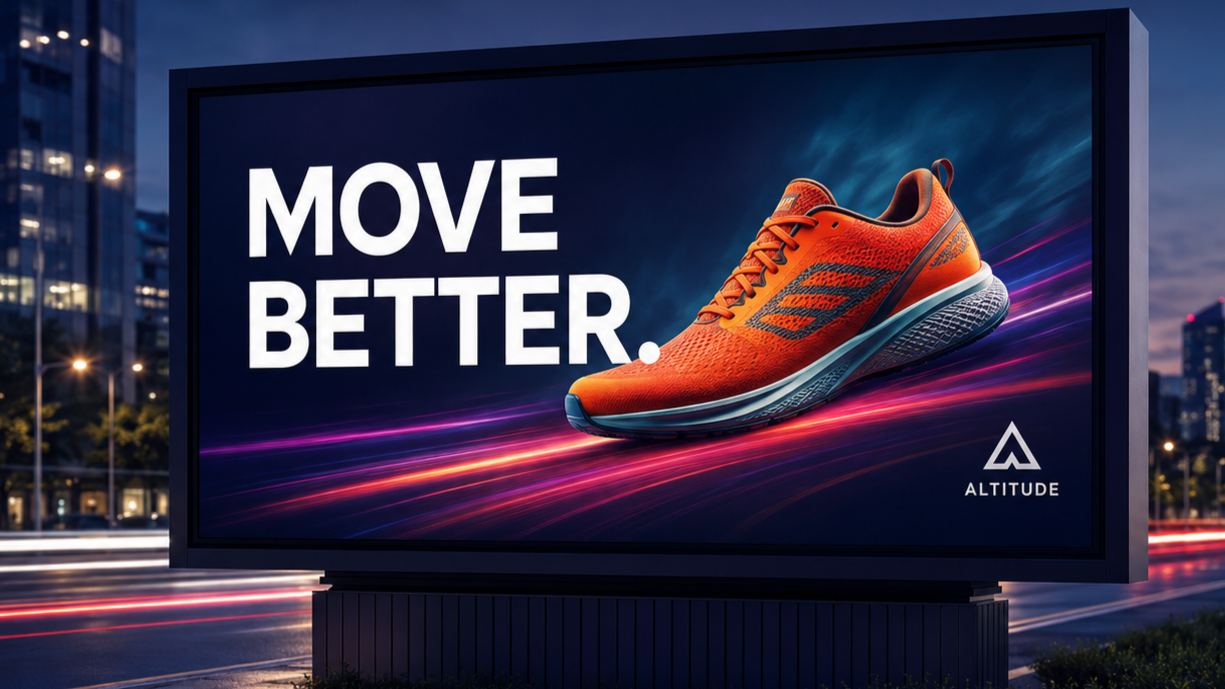
The majority of people who see your ad will only absorb the headline. They may be passing by and glancing briefly - you have approximately three seconds to capture the attention. Make your headline message count within eight words.
If your message cannot be communicated in a short headline without additional explanation, the message needs simplifying.
02

DESIGN HIERACHY MATTERS
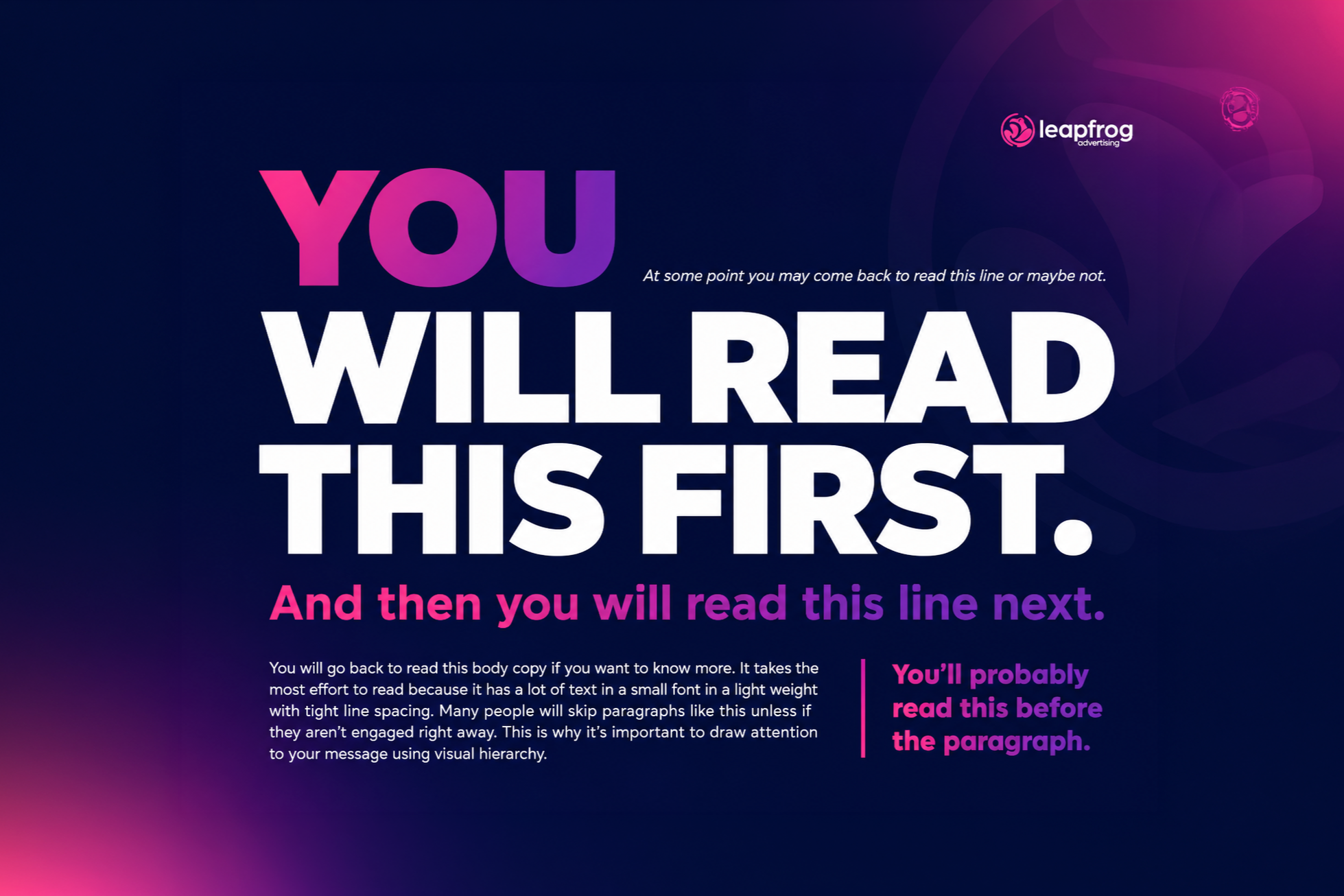
The eye moves through a composition in a predictable way. Lead with the element that carries the most weight - usually your headline or your brand, then let supporting elements follow in order of importance.
Ask yourself - if someone reads only the first thing they see, does the ad still make sense? If the answer is no, reconsider your hierarchy.
Make the first thing matter
03

LEAD WITH YOUR BRAND
OOH is one of the most powerful brand-building channels available. Lean into the elements that make your brand recognisable - your colour palette, your typography, your logo, your visual language. Consistency across formats builds familiarity, and familiarity builds trust which ultimately results in new customers.
Your logo should be placed where the eye lands early - not buried at the bottom as an afterthought. This helps build your brand’s recognisability, whilst reminding the people who are already familiar with you.
Brand recognition builds trust

04

USE STRONG, PURPOSEFUL PHOTOGRAPHY
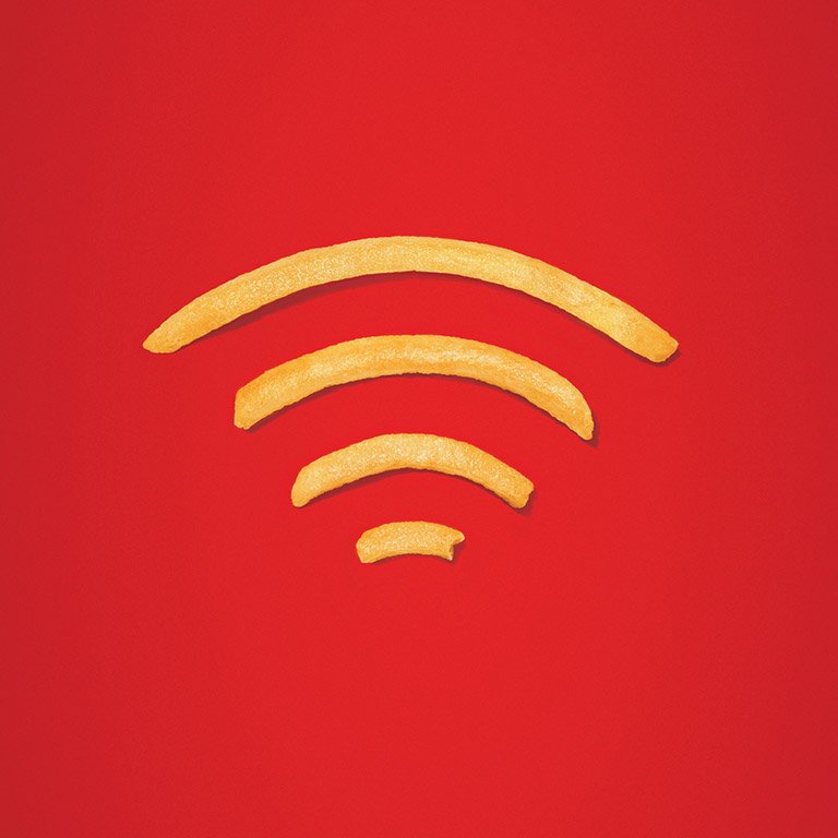
Imagery is what earns attention - Without it, the rest of the ad is irrelevant.. Choose images that are bold, clear, and immediately legible at distance.
Avoid busy or cluttered visuals. One dominant image almost always outperforms a collage. If the image needs to be explained by the text, the image may need to be changed.
One dominant image wins
05

USE HIGH-CONTRAST COLOUR PALETTE
Design for real-world visibility
Text must be legible at distance and in varying ambient light conditions. A weak contrast ratio - light grey on white, navy on black, pastel on pastel - will render your messaging invisible in the real world, even if it looks fine on screen.
A simple test: squint at your creative thumbnail. If the text still reads clearly, your contrast is working. If it disappears into the background, revise before it goes to print or live.

06

DESIGN FOR THE PLACEMENT
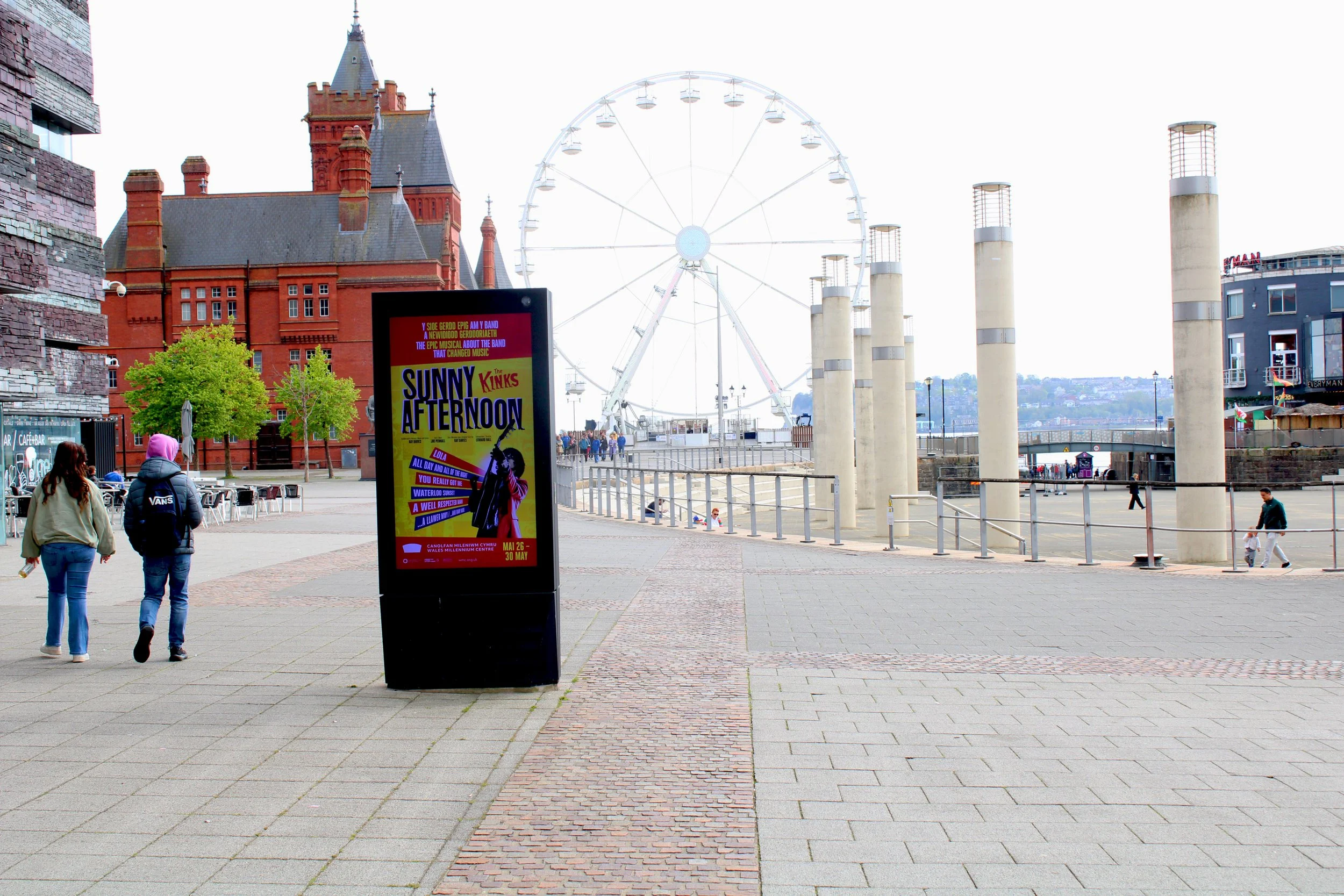
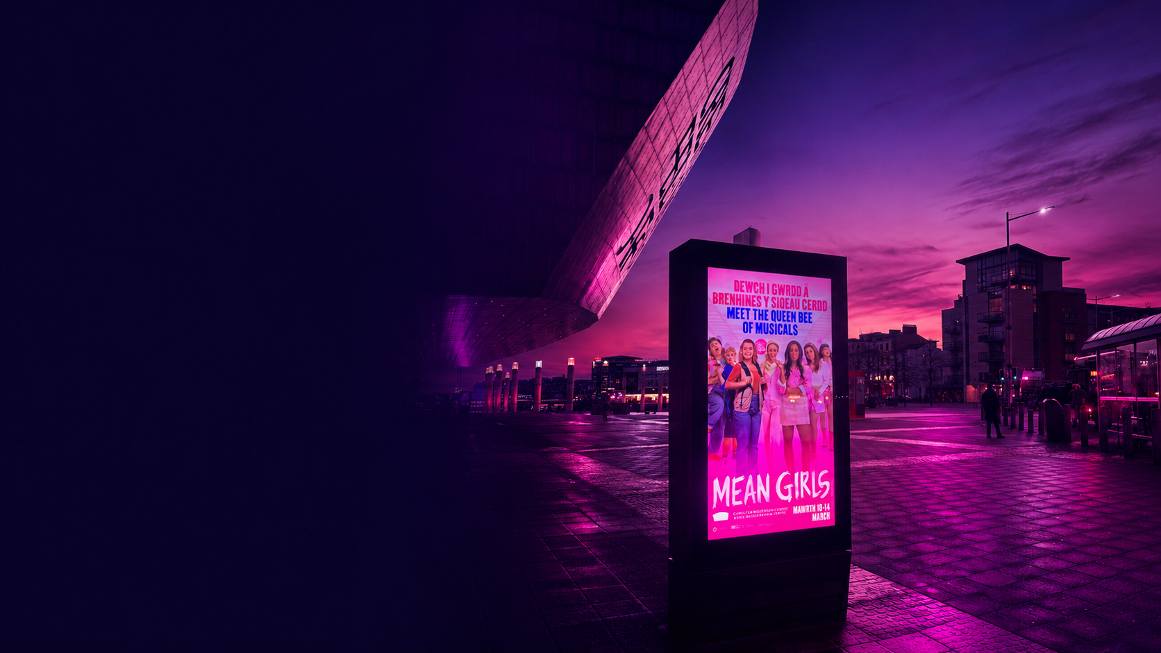
Different placements demand different creative approaches. A large-format roadside screen is seen at speed from a distance - large fonts, minimal text, and a single dominant visual are essential. A screen located in a walkway at eye level, where dwell time is higher, gives you slightly more room to breathe, but restraint still applies.
Always request the exact pixel dimensions and aspect ratio for each screen before the design brief is opened. A creative built for a landscape screen that gets stretched to portrait never works. Design natively for each format.
Format changes everything
07

THINK ABOUT WHO IS SEEING THE ADVERT
Location shapes mindset
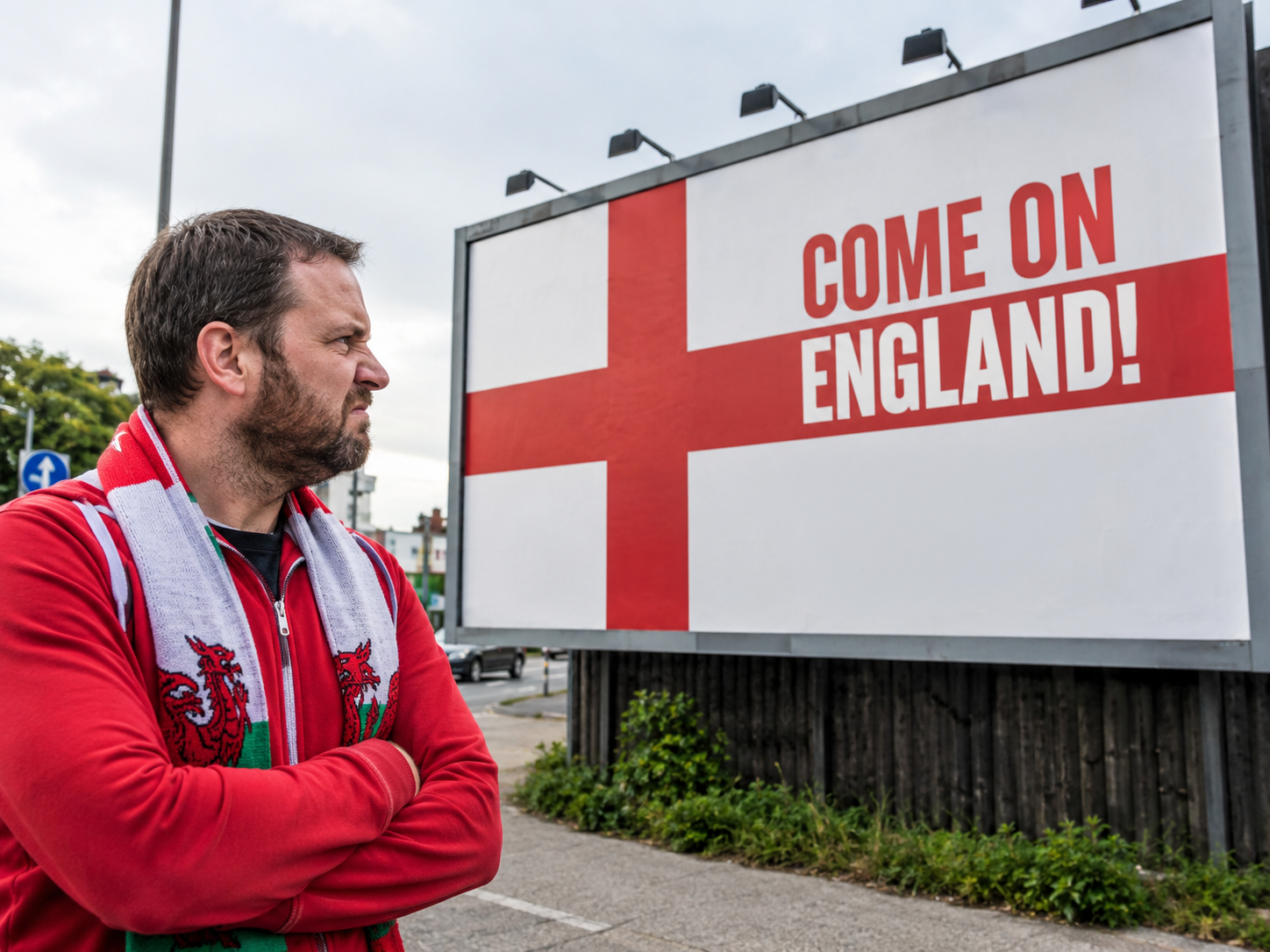
Location shapes audience, and audience should shape creative. Consider not just the demographics of who passes a screen, but the mindset they are in at that moment. A commuter at a train platform is in a different headspace to a shopper in a retail park. Tailor your message accordingly.
An example: Maybe don’t promote England’s World Cup campaign in Wales.
08

DO NOT EXPECT DOOH TO DO EVERYTHING
OOH is not a direct response channel. Cramming a URL, a phone number and three product features onto a screen because it works in digital is one of the most common mistakes advertisers make.
People are not going to stop, open their camera app, and scan a QR code whilst your ad is live. And they are far more likely to search for your brand than type out a URL. Skip both, and use the space for something that actually earns attention.
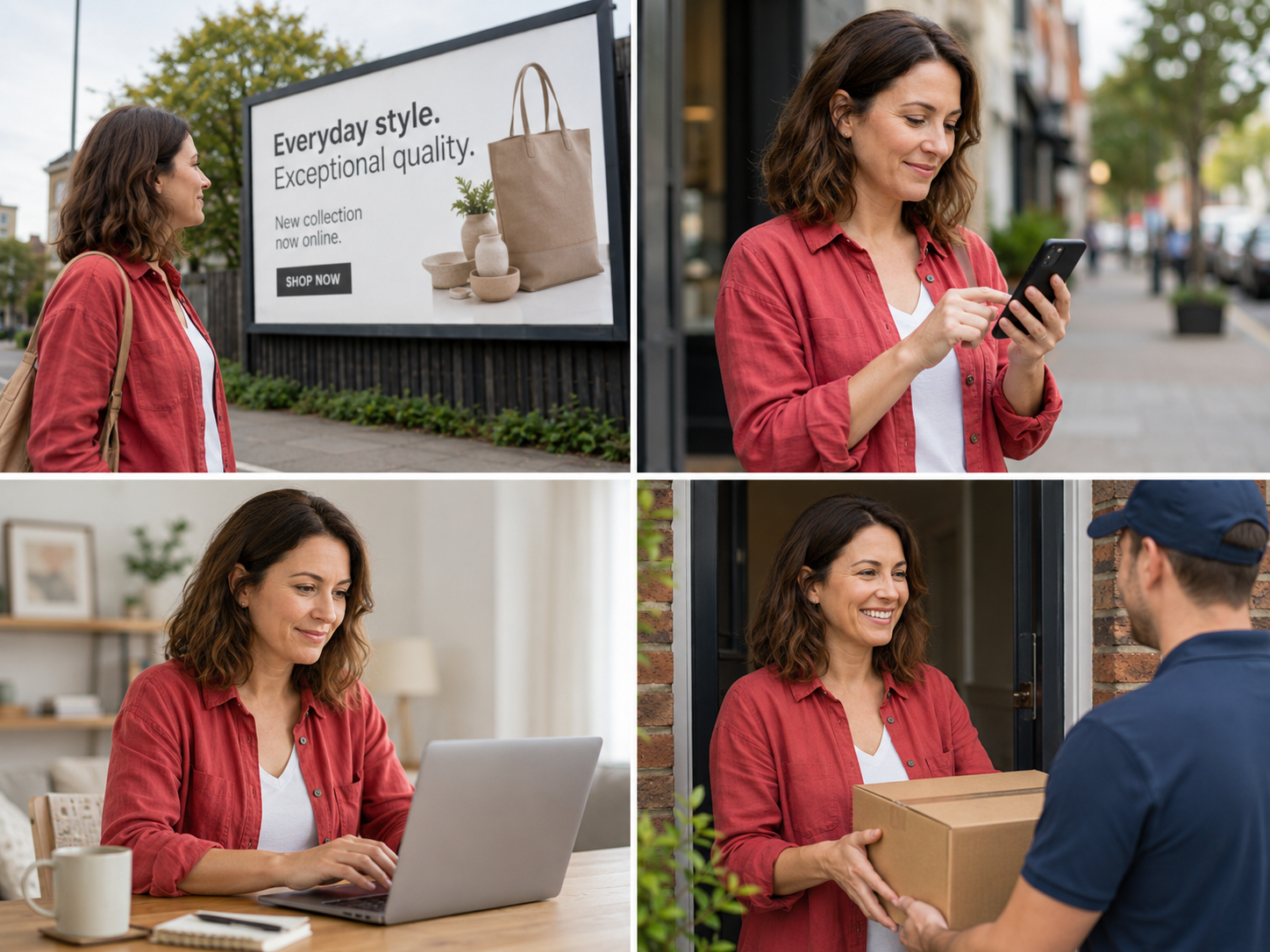
If conversion is the end goal, run Mobile Retargeting alongside your OOH campaign. Let the screen build awareness, and let a follow-up ad on Meta or Google do the converting. Each channel doing what it is genuinely good at is far more effective than one channel trying to do both.
Let each channel do its job
09

WE ARE HERE
Need some help?
If you need any help, or would like any feedback on a specific campaign please let us know - we are always here to help.
📧 hello@leapfrogadvertising.com